How to Make Carousel Posts People Actually Save
Carousels earn saves, and saves signal value. Learn how to build Instagram and LinkedIn carousels people keep coming back to, from hook slides to CTA slides.
Likes are a nod. Comments are a chat. But a save? A save means someone said "I will need this again." That is the strongest compliment a post can get, and carousels collect saves better than any other format.
A carousel is just a multi-slide post that people swipe through. Instagram and LinkedIn both love them, and for the same reason: every swipe is engagement, and engagement tells the platform your post is worth showing around. Here is how to build carousels that earn the swipe and the save.
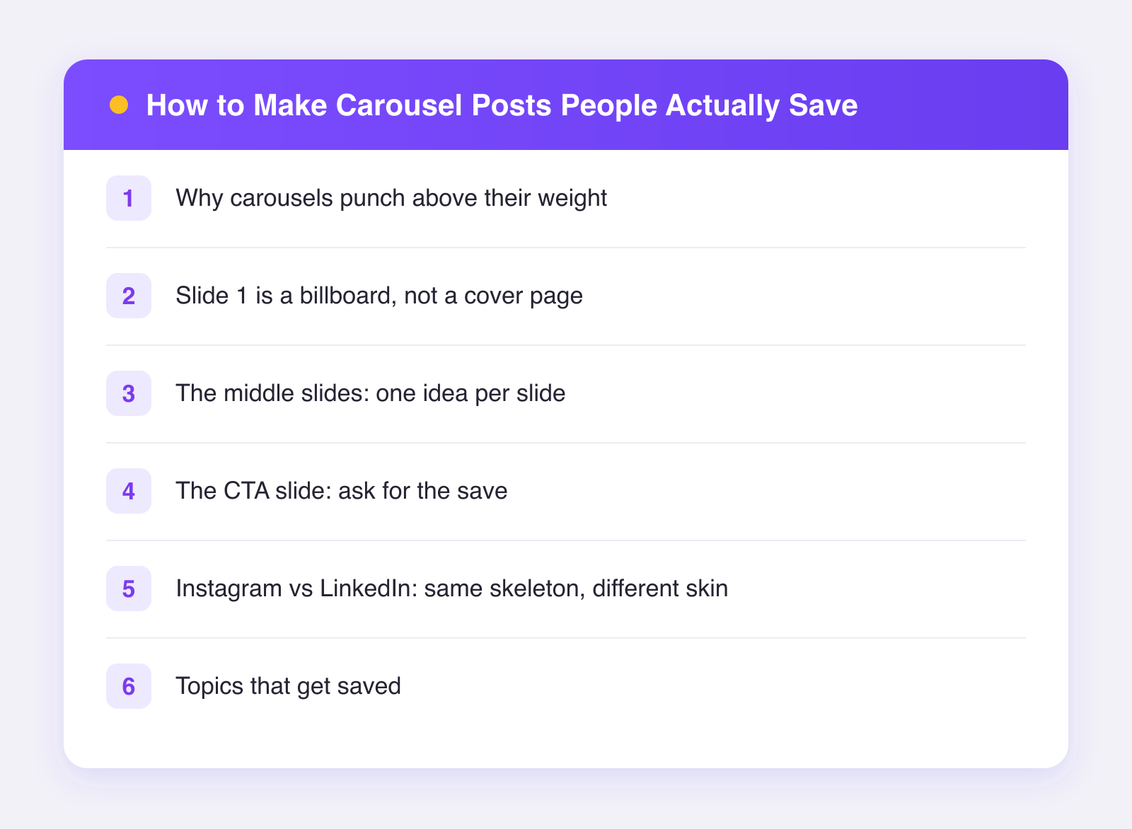
Why carousels punch above their weight
Three quiet advantages:
- Multiple chances to stop the scroll. As of 2026, both Instagram and LinkedIn can resurface a carousel to the same person with a different slide showing. Ten slides means ten first impressions.
- Time on post. Swiping through eight slides takes ten times longer than glancing at a photo. Platforms notice dwell time.
- Saves come naturally. Carousels suit reference content, and reference content is what people save: checklists, steps, mistakes to avoid, before-and-afters.
Slide 1 is a billboard, not a cover page
Most carousels die on slide one. The first slide has one job: make swiping feel necessary. Treat it like a headline on a billboard people drive past at speed.
What works on slide 1:
- A big, specific promise. "7 email openers that got me replies from strangers" beats "Email tips."
- A bold claim you then defend. "Your portfolio does not need more projects."
- A number. Numbered lists tell the reader exactly what they are committing to.
- Huge text. If it is not readable on a phone at arm's length, it is decoration, not a hook.
What kills slide 1: your logo, a table of contents, the word "Introduction," or a pretty photo with no words. Save the branding for the last slide.
The middle slides: one idea per slide
The golden rule of carousel writing is brutal simplicity. One idea per slide, one skimmable line per idea, then a sentence or two of support. If a slide needs a paragraph, it is two slides.
A structure that works almost every time:
- Slide 1: the hook and promise.
- Slide 2: why this matters or the mistake people make.
- Slides 3-8: the actual list, steps, or examples. One per slide.
- Second-to-last slide: a quick recap of everything, in tiny list form. This is the slide people screenshot, and it is the slide that triggers saves.
- Last slide: the CTA.
That recap slide is the secret weapon. It compresses the whole carousel into one image, which makes saving feel useful rather than optimistic.
The CTA slide: ask for the save
People do what you ask far more often than what you hope. The last slide should ask for exactly one action. "Save this for your next launch" outperforms "like, comment, share, follow, and check the link." One ask, stated plainly, with a visual cue like a bookmark icon.
Rotate your asks across posts: save this one, comment on that one, share the next. Asking for everything every time trains people to ignore all of it.
Instagram vs LinkedIn: same skeleton, different skin
The structure above works on both platforms, but the skin should change:
- Instagram rewards visual polish and tight copy. Square or vertical slides, bold color, minimal words. The caption can carry extra detail.
- LinkedIn carousels are documents, often PDFs, and readers tolerate more text per slide. A slightly more analytical tone fits. Slide 1 still needs a hook; professionals scroll just as fast as everyone else.
- Design once, adjust twice. Make the Instagram version, then loosen the text density for LinkedIn. Do not post identical files and hope; the platforms have different norms, as we cover in repurposing content across platforms.
When the design is done, the posting should be one step, not two. Plumefy schedules image posts to Instagram, LinkedIn, and the rest of your networks from one screen, with a per-platform caption for each, so the same carousel goes out properly dressed for both rooms.
Topics that get saved
Some content is enjoyable; other content is useful later. Saves follow the second kind:
- Checklists and step-by-step processes
- Mistake lists ("5 things I would never do again")
- Templates and scripts people can copy
- Resource roundups and comparisons
- Before/after breakdowns showing exactly what changed
If a post answers "how do I do this?" it is save bait. If it only answers "is this person clever?" it might earn a like and be forgotten by lunch.
Measure the right thing
Do not judge carousels by likes. Judge them by saves, shares, and how far people swipe when the platform shows you that. A carousel with modest likes and heavy saves is a quiet hit, and platforms treat it that way over time. If you are unsure which numbers deserve your attention, our guide to social media metrics that matter sorts the signal from the vanity.
FAQ
How many slides should a carousel have?
Enough to deliver the promise, not one more. Six to ten is the comfortable range as of 2026. Fewer than five can feel thin; the platform maximums (roughly twenty on Instagram) are rarely worth filling.
Do carousels work for reach or just for existing followers?
Both platforms push carousels to non-followers when early engagement is good. The multi-impression behavior actually gives carousels extra chances with cold audiences.
What tools do I need to design slides?
Anything that exports images or PDFs works: Canva, Figma, Keynote, even Google Slides. Consistent fonts and one strong accent color matter more than the tool.
Should the caption repeat the slides?
No. The caption's job is context and searchability: say who this is for and why it matters, in natural language with a keyword or two. Let the slides carry the content.
Build one good carousel this week: hook slide, one idea per slide, recap, single ask. Then send it to both audiences without doing the work twice. Try Plumefy free and schedule it everywhere at once.
Post everywhere, once.
Start on the free plan — no card needed, upgrade when you need scheduling.
Start free